

Brand Guidelines
チップの中核となる機能を開発し、世界の人々とテクノロジーの間のタッチポイントを拡大する、トータルメモリシステムとAI IPプラットフォーム唯一のプロバイダー。
Logos
Select a logo, or download the full logo pack.

Priamary Logo. OPENEDGES Blue.

Primary Logo. White

Priamary Logo. Black

Vertical Logo. OPENEDGES Blue.

Vertical Logo. White

Vertical Logo. Black


Logo Clearspace: When applying the logo, securing sufficient space from surrounding elements and page margins is essential.

Minimum Size (Screen): The minimum size for the OPENEDGES logo on screen is 20px in height.

Minimum Size (Print): The minimum size for the OPENEDGES logo in print is 10mm in height.

Logo Gray Scale: The logo color is determined by the brightness of the background. Always maintain sufficient contrast between the logo and its background so the logo remains clearly visible in any environment.

Logo Misuse: Maintaining a consistent logo appearance is essential. Do not reinterpret, modify, or decorate the logo in any way. Never attempt to alter the logo under any circumstances.
Colors
Use OPENEDGES colors across all brand materials. Keep combinations balanced and accessible.

Primary Colors

Primary Colors Gradients

Secondary Colors

Accent Colors
Typeface
Noto Sans KR is the official corporate OPENEDGES font.

Typeface Hierarchy: Typography is organized by information hierarchy — headline, subhead, and body — with proportional sizing across levels.

Typeface for Multilingual Use: Korean and English use Noto Sans KR as the default, while other languages such as Chinese and Japanese use their corresponding Noto Sans family (Noto Sans SC, Noto Sans JP).
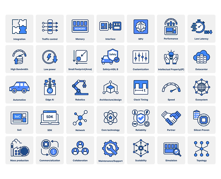
Iconography
Two color versions, built to hold contrast
across backgrounds.
Icon A

Icon B